It’s always a pleasure for us to have clients return to us to help bring the vision of the bride to life with paper, ink and a little something extra. This is the second time we assisted this busy mom for custom wedding invitations and we thank her for placing her trust in us. We wish this couple many great years ahead and plenty of grandchildren to fulfill the life of one of favorite mothers of two special daughters.
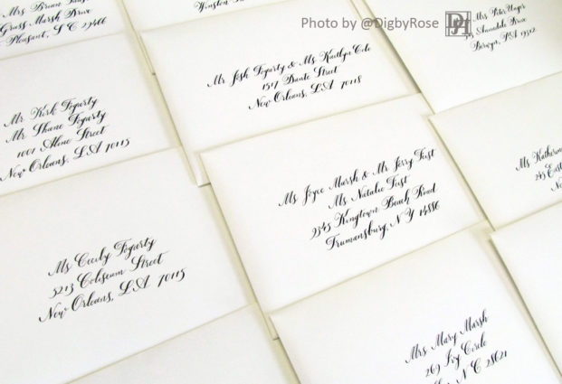
Hand calligraphy provided to Digby & Rose by the groom's mom.
We dare not take all the credit for these invitations because to truly deliver a bride’s vision, you have to have many people involved. (When we get more information about the artist who penned these, we’ll update our post).
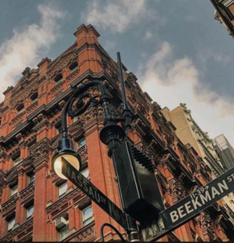
Our first meeting with the bride took place over the phone where we learned more about her taste and of course her venue. This was one of the first wedding receptions held at The Beekman, a Thompson Hotel.
Architectural Digest called it a transformation of a 19th Century Tower that was, “Transformed Into New York’s Most Beautiful New Hotel”. If you are going to have a luxury wedding this property should be a the top of the list.
The bride and groom were married at St. Peter’s Catholic Church, located at 22 Barclay Street-New York, NY 10007. We’re told that the ceremony was meant for such a historic Church.
A few months after the ceremony I penned a little thank you note to the mom for trusting us again to deliver. A few weeks later she wrote, “Thanks for all your help in making it a perfect day for them.” Your so welcome and remember that we also design and make custom baby shower announcements ; ).
Photo: Courtesty of The Beekman Hotel
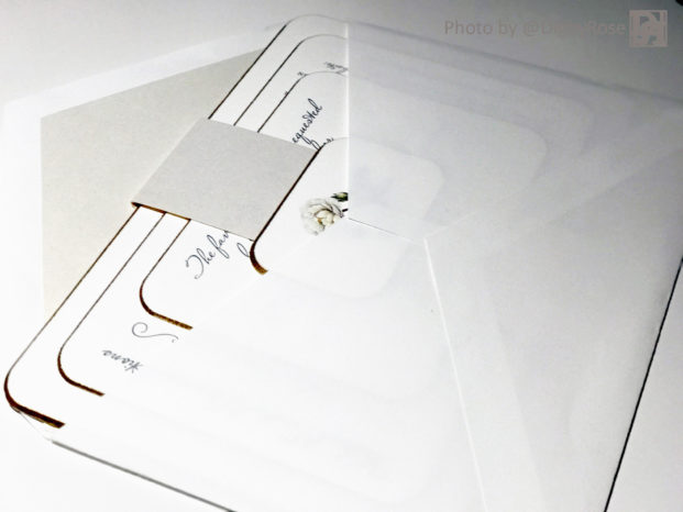
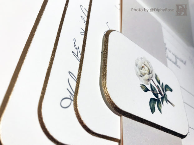
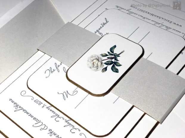
And now for the custom New York, NY invitations for the wedding event of the season. It’s eye candy of a joint effort to bring together this luxury wedding invitation set. It’s a set of stacked cards with rounded corners and a shimmer gold paint. The bride wanted us to use one of her favorite antique flower images in someway, so is there not only something special holding it all together-the back has it too.
The look of thick invitations coming out of an shimmer paper lined envelope.
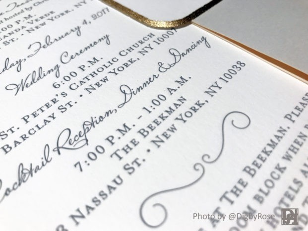
Letterpress for The Beekman, NYC
Gold beveled and rounded corners on
thick cotton paper.
Image getting invited to wedding
event of the season in NYC.
Again, many thanks to all who have participated in bringing the wedding invitations to life. If you are going to share our content, we only ask that you give @DigbyRose proper photo credit. More to come with our creative commons license.
We didn’t even realize that these were going into print in The Knot Weddings Magazine and would like to thank them for including us at the request of the bride. Best Wishes, Team Digby & Rose
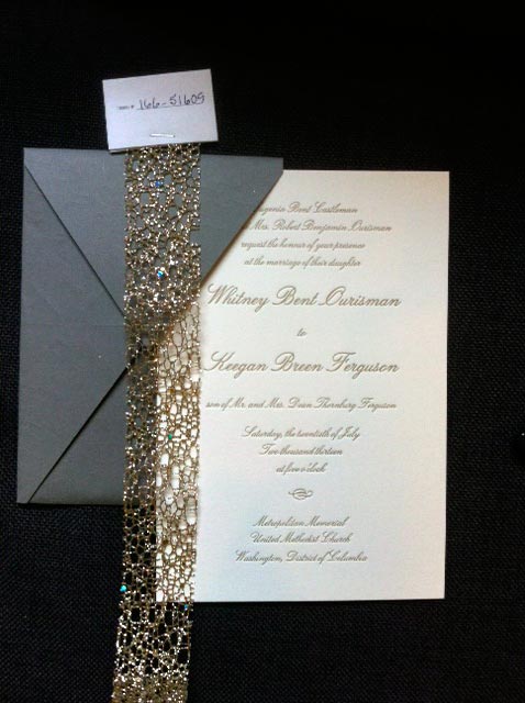
We recently received a batch of lovely ribbons from Ampelco Ribbon Company, a family-owned company based in Downers Grove, Illinois specializing in creating beautiful, elegant ribbons and trims. We thought it might be fun to pair some of their best ribbons with our own invitation samples to inspire anyone looking to add a little flair to their wedding invitations.
This matte gray envelope promises beauty and delivers just that when its contents reveal cream-colored heavy weight cotton invitations with gold foil letterpress in an elegant cursive all wrapped up in a belly sleeve of delicate gold glitterweb ribbon. The last detail is what will really blow your guests away and further prove that your wedding is going to be the most elegant of affairs.
After months of agonizing over what your color scheme should be, consider a ribbon in the invitation that further solidifies what you have now chosen to be the most appropriate and note-worthy color scheme of all weddings.
Pictured left is an invitation in royal blue letterpress on white cotton behemoth that could be further expanded to include a light, sea-green blue strip of glitter with a darker, royal blue velvet lining. This breathtaking combination of colors and materials would be a fantastic way to elaborate on your wedding color scheme and give your guests a glimpse into what they should expect from your wedding: style and sophistication.
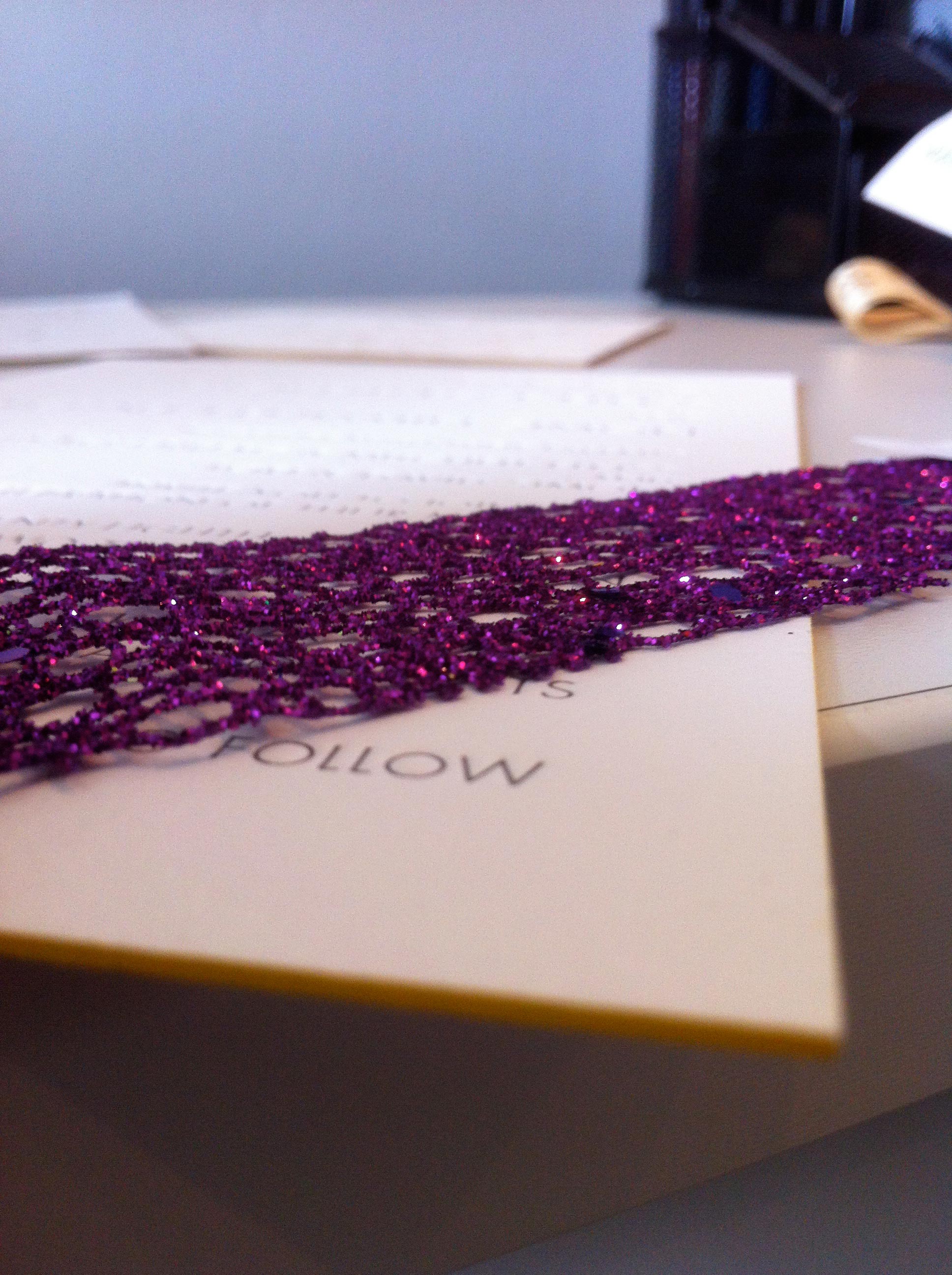
To be honest, I’m pretty partial to colors gold and purple being paired up. What could be more refined than the primary colors of royalty? Sunflowers and lilacs, lilies and clematis, daisies and violets; because the two colors are opposite of one another on the color wheel, it makes them complimentary to each other and therefore pleasing to the eye. That’s why this invitation of heavyweight white cotton, grey letterpress and yellow painted edge would be wonderfully paired with this glitterweb purple ribbon.
There are so many options available out there to make your invitation stand out from the rest, so it’s important to consider them all. Just remember, here at Digby & Rose, we can make anything happen.
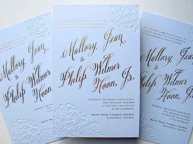
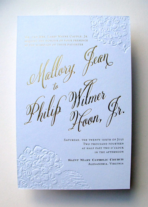
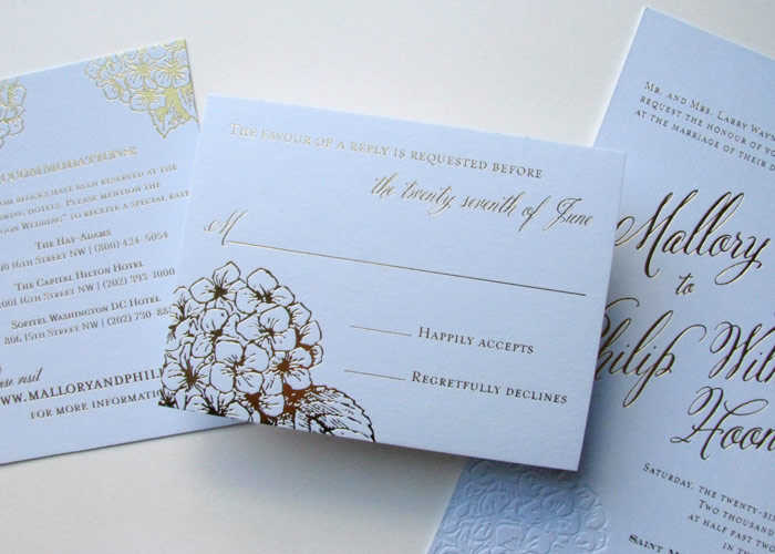
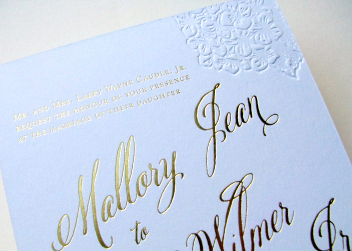
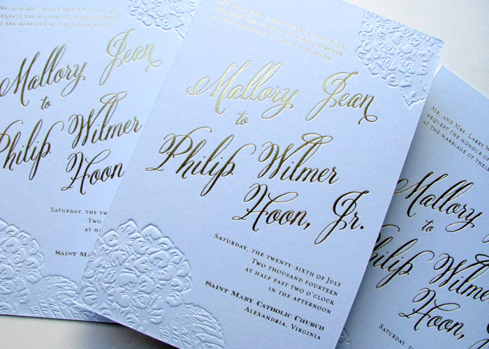
These blue and gold foil hydrangea wedding invitations were the perfect announcement for a summer wedding in Washington, DC! The hydrangeas were pressed with a blind emboss on thick light blue cotton paper, and the text was shiny beauty with a gold foil stamp. The gold print continued on the reply card and other pieces, making for a fully blue and gold stunner for this DC wedding. Everyone who received this invite knew it would be an elegant affair!
Powder Blue Paper and Gold Foil
How we love that thick 222lb cotton paper is now available in light blue, navy, and gray! It is perfect for the letterpress printing that created the light blue hydrangeas on the invitations. One of the prettiest summer flowers, hydrangeas now come in gold! The matching cards were also done on powder blue paper. This set would look great with a matching gold envelope liner. For your own custom flower invitations contact us in our Washington, DC studio!
For another take on a hydrangea wedding invitation, check out this set!