Multi Color Letterpress Cards
Negative Space and Letterpress
To truly understand letterpress card design and how to use color and the paper, you have to know how to use negative space. There is one exercise I remember doing during art class that really drove this point home. The task was to draw the outline of every shape I could see from my vantage point. I drew the outside edges of a plastic plant, the table, the lamp, the window and the chair. All of a sudden it came to me that everything lives in negative space and my world got pretty large. Now when I look at people, things and spaces, I notice that I observe more of the unoccupied space around people and things. It’s that ability to see the negative space that makes for great design in letterpress, because the negative space is that which when printed is what you feel. If a picture is worth a thousand words then the touch is too. These cards were designed and made by Leslie Ross Robertson and printed using soy inks. I really love her work because she understands negative space and has an appreciation for mid-century architecture and design.
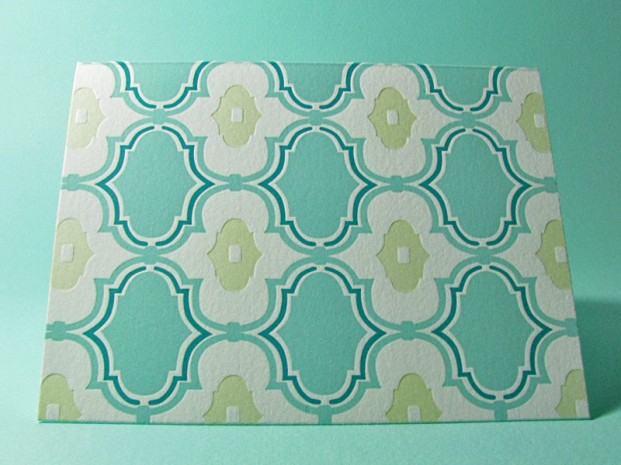 Modern Damask Three Color Letterpress Card
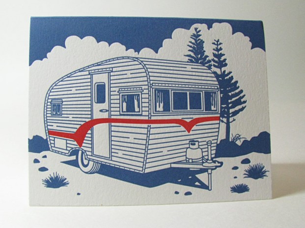 Two Color Classic Air Stream Letterpress
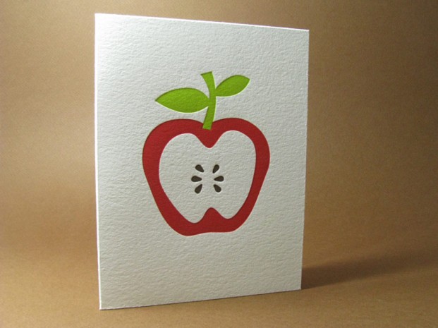 Teacher’s Favorite Apple Card Three Color Letterpress
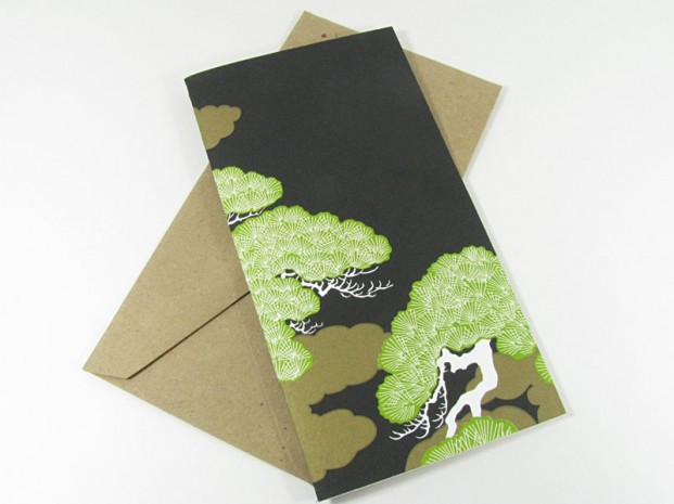 Bonsai Tree Three Color Letterpress
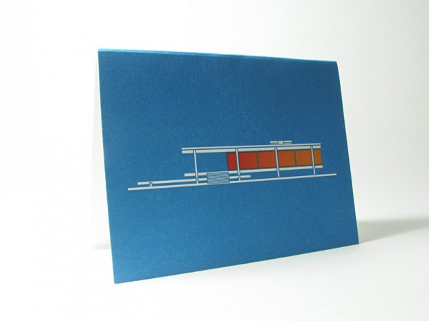 Mid-Century Modern House Letterpress Card
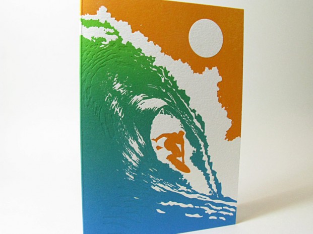 Surfer Card Three Color Letterpress with Fade
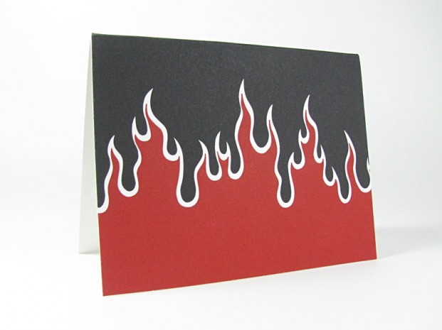 Flame On Two Color Letterpress
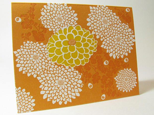 Chrysanthemums Flower Card in Three Color Letterpress
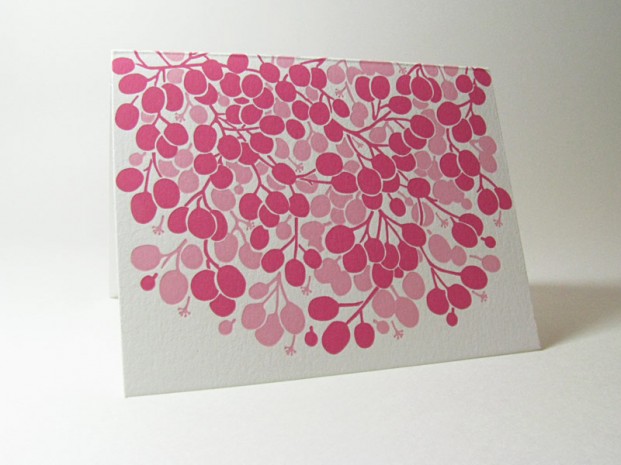 Ripe Berries Two Color Letterpress
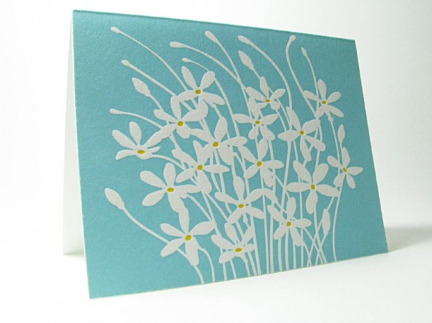 Wild Flowers Card Two Color Letterpress
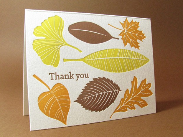 Fall Card Three Color Letterpress
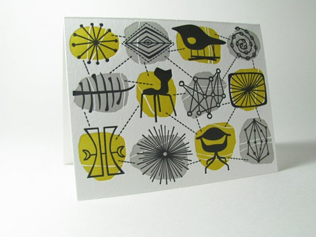 Mid-Century Modern Connections Card in Three Colors
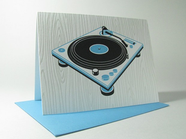 Retro Record in Two Color Letterpress
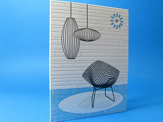 Mid-Century Modern Chair and Light in Three Color Letterpress
We hope you enjoyed the photos and if you need to order any of these, get in touch here with your question.